Thursday, 21 February 2019

QR CODES EXPERIMENTS

Tracing it using Illustrator's brush tool.
the code works sometimes, but not everytime. 

tracing it using a marker
it didn't work because the lines weren't straight enough. 

changing the colour into earth tone 
it didn't work because the colour was too light.

Tuesday, 19 February 2019

SUBMISSION BRIEF

OUGD401 PRE-SUBMISSION BRIEF

4A1
  • individual subject disciplines.
  • publication
  • requires to show awareness n understanding of the context 
  • through practical work 
  • aware act who audiences 
  • their social, political circumstances 
  • blog, 2 essays, practical brief —> cohesive, as a whole

4A2
  • explicitly showing u have a wide range on contextual research
  • theories 
  • practical has to link the essays 
  • show your practice is building the knowledge , applying ideas 
  • how those written pieces relate to the practical brief 
  • how it is influenced by your writing 

4B1
  • what you do with those research sources
  • research for written as well as practical 

4C1
  • evaluating, analysing  
  • how images relate to each other 
  • 2 essay —> select approaches 
  • gather info —> make sense of that 
  • practical—> effective process, experiments 

4D1
  • quality of academic writing
  • use of Harvard referencing 
  • arguing the best possible way using evidence 

design boards:
  • techniques, theoretical strategies 
  • authors: xxx 
  • referencing the same thing
  • research: specific to that project (not essay) 
  • visual research 

SB1
  • at least 10 blogs —> accessing learning outcomes 
  • PDF to e-studio submission box 
  • images 
  • documenting

SB2
  • 1250 x2
1: definition, history, key developments
  • 3 key developments
  • demonstrate ability to take compress all research 
  • summarising 
  • why you’ve selected those developments 
  • look at these wider context—> make that make sense within area of graphic design 
  • impact on graphic design, on the way that we do that practice today

2: critical debate focusing on a set question 
  • forming particular perspective/ argument on the issue 
  • argument/ perspective 
  • highlight particular issue 
  • debate, discussion 
  • images 

  • 12pt Ariel, 1.5 line spacing, images included 
  • Harvard referencing 
  • bibliography 
  • third person 
  • at least 6 distinct references 
  • images: with colours, in the text or in a section at the end 

SB3 
  • self set brief 
  • research aims
  • wt you’re trying to explore
  • brief on blog 
  • brief on rationale 
  • analysis of your work —> wt r u trying to explore, what have to found out 
  • explore particular issues/ tech/ debates/ contradictions/ aspects of lifestyles in essay2 

project statement (evaluation)
  • why have you chosen the brief
  • how does your outcome fulfil the requirements as out
  • what have you found out
  • cohere with essay?
  • does it work?
  • understanding of theoretical n practical 
  • explains how your practical work examines and explores the issue raised in your written work 
  • no work limit 
  • abt 500 words 

SUBMISSION (26/2 13:30-15:00 Room 134)
  • A3 submission file 
  • 2x1250 essays printed and staples
  • may not have the final outcome but put it in file
  • 6x design boards printed on A3
  • project statement
  • blog in PDF to drop box 
  • module submission label 

* end of module feedback on e-studio 

Friday, 15 February 2019

CRIT

- liked the aesthetic n how the colours worked well
- looks "carhartt"
- incorporate the qr code into part of the design
- using QR codes to block images, so they look like they are part of the product
- what to print on?
- why hard cover?
- how do you push the idea of making people curious about the products?


- research on what people like reading materials to be like

HOW DO YOU INCORPORATE QR CODES INTO A DESIGN???????
- redraw them by hand?
- trace them digitally? (graffiti effect)

Found this on the internet when I was doing research on how people incorporate QR codes onto their designs. It is interesting that the designer tried to

Tried out different ways to make incorporate the QR codes into my design.


Wednesday, 13 February 2019

PLANNING

As there will be a lot of different layouts used in a magazine, Decided to write them all out and have a clear plan of which pages using which layouts. 


Tuesday, 12 February 2019

CONCEPT 3 - COLOURS N TEXTURES

background - textures/ colours

  1. workwear colours
  • —> earth tones (beige, brown, green)
  1. bright product colours 
  • —> bright colours (yellow, purple, blue, green…)
  • —> same colour tone as product 


  1. contrast colours of product 


  1. graffiti overlays 
reference:

what i did:


  1. skateboards elements 
  2. tropical patterns of products
  • —> for image collage
  • —> screenshot textures and patterns from products (close ups)

CONCEPT 2 - LAYOUTS

layout 
- contemporary streetwear magazine
  • collaging 
—> images with images
—> shapes with images


—> textures with images


CONCEPT 1 - MAKING IMAGES HARD TO LOOK AT

DAY 2:
  • for 3 general concepts/approaches to your outcome 
  • at least 5 developments for each general idea
( layouts, type choices, colour systems, paper stock, binding. interactive elements, etc.) ( experiments with collage, juxtaposition, photocopying, scanning, wet media. etc)

  • blog post for each concept, how u pushed the idea forwards, h ow you gonna present them visually
  • documenting 
  • ongoing evaluation, acknowledging which works best, why you’ve done that, what you’ve gain, is it working, works for target audience? 
  • why is it working? why you doing them in the first place 
  • semi-polished ideas on the sketches 

Simon:
  • people wont really go scan the code
  • how do you make them really using the code?
  • research for interactive prints 

3 concepts, 5 developments each

making the images hard to look at/ unclear
  • crossing out-

  • pixelating -
  • burn
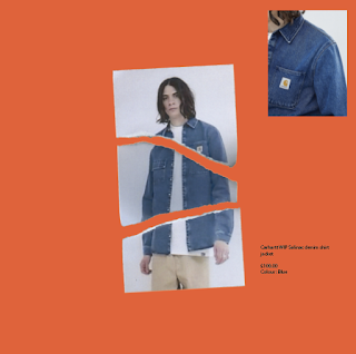
  • tear
  • erasing
    scanned by phone

    scanned by scanner 


  • put tape on it
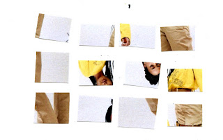
  • make it a puzzle
scanned by phone


the phone scanned version looked much rougher and grained. Because fo the low quality of the phone compared to the scanner version, the image looked a lot more in a low resolution. Although the image looked raw, I think it suits the brand image of Carhartt being stiff and tough. 


scanned by scanner 

the scanned version look a lot clearer and after edited, the background looks pure white and blends in well with the background. However, it looked too clean and minimal after placed onto the page and did not really suit the tough image of Carhartt.


  • tear a hole
  • clone
  • distortion
  • crumpling-
    scanned by phone

    scanned by scanner 


research for interactive prints 

Simon:

  • people wont really go scan the code
  • how do you make them really using the code?

Monday, 11 February 2019

RESEARCH ON MAGAZINES

CONTEMPORARY FASHION MAGAZINE
--> different styles
--> take the one suits carhartt the most for reference 

1Granary 
  • student-run magazine 
  • Works as a bridge between education and industry, where both can work together collaboratively, just being creative, for creativity's sake
  • celebrates the best talent from Central Saint Martins 
  • Provides an intriguing look at the everyday life and work at CSM 
  • Celebrate and debut the work of students past and present, alongside insightful advice from those already established within industry 
  • Interviews with stylists 
Layouts:


  • text aligned to the edge of the page
  • New typeface for the headings
  • Regular for the caption
  • Italic for the extra information of the image
  • Centred quotes

Buffalo Zine


  • slow paced publishing 
  • Anarchic approach to magazine format 
  • Two kilo coffee table book exploring youth culture and nostalgia
Layouts:
  • With no fixed style
  • Artsy approach 
  • Always with playful typography 
  • Background could be a photographed texture (not only plain colours) 
--> artsy approach doesn't suit a workwear brand
--> textured background might work


Gentlewoman
  • timeless aesthetic
  • Attention to details 
  • Elegant and clean 

Layouts:
  • text could be placed vertically, so as images
  • Images could be placed on a page using the simple 4 grid system
  • Images could be placed with a white border or occupying the whole page

  • Image captions could be overlaid on top of images
  • Make use of the sizes of text to act as a distinguisher between headings/ subheadings and body text
  • Images could be duplicated in a page to create an interesting layout
  • Use big typography or numbers on one page to separate different sections of the magazine 
  • A line could be used to separate text sections 

human being


  • bi-annual print magazine
Layouts:
  • clean modern design
  • Iconic design: using coloured frames to layout images on the centre of the page
  • Place text on the coloured frames, surrounding the images
  • Barcode at the side of images, on the frames --> could place QR code like the way they placed the barcodes --> at the edge/ corner
Œ Magazine
  • concentrates on showing fashion by purely focusing on images
Layouts:
  • images could be placed in a randomly collaged layout
  • Wise use of geometry, using triangles for titles and rectangles to collage with images to create breadth 
  • Bright coloured text and headings to make them standout from images
  • Use white boxes to chop off images for placing text

Sum Zine
  • Focuses on sustainable fashion
  • Has their own instagram account -->The company have acknowledged the fact that their audiences are adopters of new technology and are very engaged in social media such as instagram --> posts main elements of their content on instagram
  • As they have online platforms like online magazine and instagram, information could be spread via the internet, therefore, for the physical magazine, they could focus more on the visuals and layouts without cramping paragraphs of informative text --> do not really have much information on the printed magazine 
Layouts:
  • pastel and bright colours
  • Bold coloured borders
  • Less condensed text
  • Minimalist

STREETWEAR MAGAZINES

Highsnobiety


  • has a youtube channel with interviews and videos about music, art and fashion
  • Instagram account is a great platform to find inspiration for both style and photography 
Layouts:

  • clean layout designs
  • Significant grid system
  • White bordered background
  • Body text centred on the page leaving white space on the sides
  • Headings incorporated on product images
  • Text could be overlaid on images and photos
  • Text either centred on the page or aligned to the sides
  • Image on image to create a photo collage

HYPEBEAST
  • hong kong based
  • Youtube channel with inspirational content that has features of celebs, desingers, event coverage, street styrl, and documentary-like films
Layouts:
  • simple yet significant cover layout design 
  • text could be both hand written and typed out 
  • The spine does not act as a limitation for placing images
  • Interviews: bolded text for questions, regular text for answers
  • Centred image with centred text below
  • Dot as a section separator

FGUK magazine
  • london based
  • Urban fashion magazine
  • Streetwear mainly focusing on menswear
  • sell both Digital versions and printed versions
  • Sell magazines in a bundle from where consumers get to have both the digital snd the physical magazine
Layouts:
  • Making use of barcodes as visual element on cover
  • The iconic FGUK typeface
  • Bnw images with bright type and background colours


Ideas development

  IDEAS DEVELOPMENT  Is art direction the most important sector in fashion branding? (Do customers really care about the concept behind e...